

The right frame does more than surround a piece of art. It sets the tone, sharpens the composition, and helps the work sit confidently in its space. Whether you are framing a contemporary print, an original painting, a photograph, or a treasured drawing, choosing from the many available art gallery frames requires a balance of design judgement and practical thinking. A well-chosen gallery standard frame should feel intentional without competing for attention, giving the artwork presence while protecting it for years to come.
Start with the artwork, not the frame
The most common framing mistake is choosing a style in isolation, based only on what looks attractive in a sample corner. A gallery standard frame should respond to the artwork itself: its medium, palette, scale, and mood. A delicate pencil drawing needs a different visual treatment from a bold abstract canvas, and a photographic print often benefits from a cleaner, more restrained presentation than a richly textured oil painting.
Begin by studying the work at a distance as well as up close. Ask what should lead the eye. If the artwork is already visually strong, the frame should usually take a quieter supporting role. If the piece is subtle or minimal, the frame may need to provide a little more structure so the work does not disappear on the wall.
- Colour temperature: Warm woods tend to flatter earthy palettes, while black, white, and muted finishes often suit monochrome or contemporary pieces.
- Visual weight: Larger or darker works usually need a frame with enough depth or width to feel grounded.
- Medium: Works on paper typically benefit from glazing and often a mount; stretched canvas may be framed with a tray frame or a simple gallery profile.
- Setting: A frame that looks right in a bright modern room may feel too stark in a traditional interior.
This is also the point to think about permanence. If the piece has financial, archival, or sentimental value, presentation should never come at the expense of protection. Materials matter just as much as appearance.
Select a gallery standard frame profile that complements the work
Gallery framing is often associated with clean lines, disciplined proportions, and finishes that allow the artwork to remain the focal point. That does not mean every frame must be plain. It means detail should be controlled. A slim black frame can make a photographic print feel crisp and intentional, while a natural oak profile can soften contemporary art and add warmth without visual clutter.
When comparing art gallery frames, it helps to think in terms of profile, finish, and depth rather than simply colour. A narrow face width can look elegant on small and medium works, but larger pieces often need extra substance so the frame does not appear mean or underscaled. Likewise, a deeper profile can add presence and a more architectural feel, especially in rooms with high ceilings or broad wall space.
For homeowners, collectors, and trade buyers who want a considered finish, Funky Picture Frames brings the advantage of bespoke handcrafted production in the UK. That matters when standard off-the-shelf dimensions or generic finishes do not quite serve the piece.
| Frame choice | Best suited to | Effect |
|---|---|---|
| Slim black profile | Photography, graphic prints, modern art | Crisp, contemporary, disciplined |
| Natural wood profile | Drawings, textiles, soft-toned prints, calm interiors | Warm, understated, organic |
| White gallery frame | Minimal works, bright interiors, airy displays | Clean, light, unobtrusive |
| Deep box or tray style | Canvas, float-mounted work, statement pieces | Structured, substantial, gallery-like |
As a rule, decorative mouldings rarely suit a true gallery standard look unless the artwork or interior specifically calls for contrast. Simplicity is usually stronger, but simplicity still needs refinement. The best frames feel deliberate in their scale, finish, and craftsmanship.
Use mounts, glazing, and backing to improve both appearance and protection
If the frame is the visible structure, the mount and glazing are what make the presentation feel complete. A mount creates visual breathing room around works on paper and can transform a modest print into something more composed and elevated. The width of the mount should relate to the size of the artwork and the wall it will hang on. Narrow mounts can feel modern; more generous margins can add quiet importance.
Glazing choices are equally important. Standard glass may be suitable for some decorative uses, but many artworks benefit from better clarity, reduced reflection, or UV protection. The goal is not only to protect the piece but also to make it easier to enjoy in daylight and under interior lighting.
Key considerations for finishing the frame
- Mount colour: Off-white, soft white, and light neutral tones are often safer than bright white, which can look harsh against older papers or muted palettes.
- Glazing type: Consider anti-reflective or UV-protective options for valuable works or rooms with strong natural light.
- Backing materials: Acid-free components help prevent long-term damage to works on paper.
- Spacing: The artwork should not press against the glazing, particularly if the medium is delicate or textured.
These details are often overlooked because they are less visible than the outer moulding, yet they have a major influence on how professional the finished piece feels. If you are framing original works, limited editions, or sentimental pieces, this is where cutting corners can become expensive later.
Get the proportion and placement right
Even a beautifully made frame can look wrong if its proportions are out of step with the artwork or the room. Good framing is partly about scale. A very thin frame around a large dramatic piece can look underpowered. A heavy frame around a small delicate drawing can overwhelm it. The same logic applies to hanging position and the surrounding furniture.
Before you commit, lay out the key decisions in order:
- Measure the artwork accurately. Include whether the full edge should be visible or slightly covered by the mount or rebate.
- Assess the wall. Consider wall width, ceiling height, and what sits beneath the artwork.
- Match frame width to scale. Larger pieces usually need more visual substance.
- Test finishes against the room. Hold samples near flooring, paint, and nearby furniture.
- Think in groups if part of a series. Consistent frames can unify varied artworks, while slight changes in mount width can create hierarchy.
For gallery walls or multi-piece arrangements, consistency usually matters more than individuality. Repeating one profile in different sizes often looks more sophisticated than mixing several unrelated frame styles. If the aim is a polished interior rather than an eclectic collage, restraint wins.
It is also worth considering viewing distance. In a hallway, staircase, or open-plan room, the frame needs enough presence to read from afar. In a study or snug where people will stand close to the work, finer details and subtler finishes become more noticeable.
Choose art gallery frames with confidence
The best art gallery frames do not shout for attention. They create a sense of completeness, allowing the artwork to sit properly in the room while offering the protection and structure it needs. When you choose with the artwork first, then refine profile, finish, mount, glazing, and proportion, the result feels composed rather than improvised.
If in doubt, aim for clarity over novelty. Clean lines, honest materials, and careful sizing will outlast passing trends and keep the focus where it belongs. And when a piece deserves a more exacting finish, working with a specialist such as Funky Picture Frames can make the difference between a frame that merely fits and one that truly elevates the artwork. A strong frame should never feel separate from the piece it holds; it should feel like the final decision that makes everything else look right.
************
Want to get more details?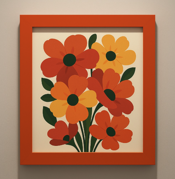
Funky Picture Frames | Bespoke Handcrafted Picture Frames Manufacturer UK
funky-frames.co.uk
London (Shadwell) – England, United Kingdom
Discover bespoke handcrafted picture frames perfect for exhibitions and galleries. Shop now for unique designs and global shipping options!